I don't enjoy using Tailwind
I used Tailwind and I didn’t like it so I wrote yet another Tailwind article. You probably don’t need to read it.
I have been using Tailwind professionally for over a year because my team made the decision to use it and I fully agreed. I wanted to give it a fair shot, and I did. After a year, oh boy, did I regret it.
#Write-only code
In Tailwind’s documentation, you can read the following right after discovering the principle of utility classes:
<div class="p-6 max-w-sm mx-auto bg-white rounded-xl shadow-lg flex items-center space-x-4">Now I know what you’re thinking, “this is an atrocity, what a horrible mess!” and you’re right, it’s kind of ugly. In fact it’s just about impossible to think this is a good idea the first time you see it – you have to actually try it.
Yes, this is an atrocious mess. It’s not just “kind of ugly”, it’s unreadable. When you write Tailwind classes, you intentionally obfuscate your code. You often read detractors of Tailwind saying that this is basically inline styles, but it’s not. It’s far worse. It’s unreadable inline styles. And you can cram pseudo-classes and media queries in there too, just for good measure.
You might also notice that class="chat-notification-message", while being absurdly long, is documenting the HTML code, explaining what it does.
You wouldn’t write all your HTML and JavaScript in one line, so why would you do it with CSS?

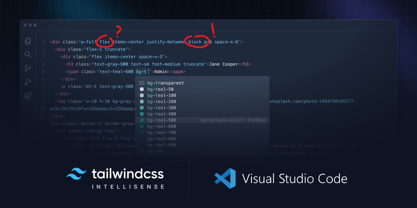
The banner of this article, the cover image of the official Tailwind VS Code extension, is a testament to the fact that proofreading Tailwind code is a nightmare, even for seasoned Tailwind developers.
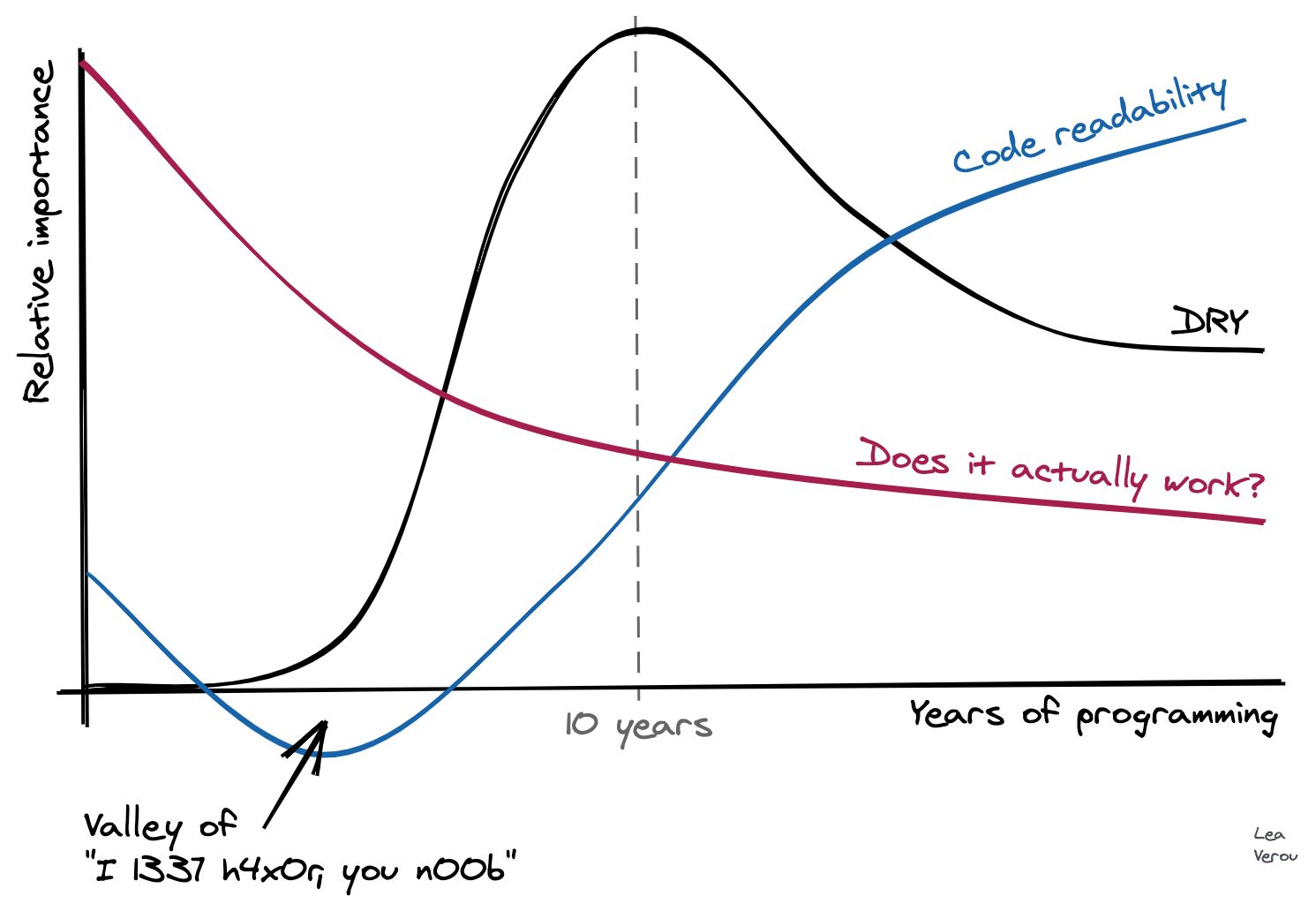
Please enjoy this humorous graph by Lea Verou, member of the W3C CSS Working Group:

I view Tailwind as the lowest point of this graph. I can’t imagine a more unreadable way to write styles.
I fully admit that writing styles with Tailwind is fast, especially with auto-completion. But as a developer, you don’t only write code, you also maintain it. Compared to pure CSS, Tailwind is unreadable, but that’s far from the only problem.
#Utility classes aren’t utilities
I don’t get why Tailwind is called a “utility-first” framework. It does not abstract away CSS properties, it maps one-to-one with them. It means that you still need to learn CSS to be proficient with Tailwind, which is not the case with old-school frameworks like Bootstrap.
So far, I have only used one utility class that I would consider a utility: truncate.
.truncate {
  overflow: hidden;
  text-overflow: ellipsis;
  white-space: nowrap;
}
It abstracts away CSS properties to expose a design concept: truncating text.
On the other hand, the rest cannot be considered utilities. Consider the following code:
<div class="flex flex-col gap-4">
  <child />
  <child />
</div>
Why do I have to specify flex flex-col?
flex-col should include flex, it’s in the name and it wouldn’t make sense to use flex-col without flex.
I find myself writing flex flex-col gap-{n} all the time. A real utility-first framework would expose a stack-{n} like this:
/* This is a utility class: */
.stack-4 {
  display: flex;
  flex-direction: column;
  gap: 1rem;
}
Tailwind is a pile of macros, not a utility-first framework.
Also, did you know that Emmet, which ships with VS Code, supports expressions pretty similar to Tailwind’s? Typing m0Tab will expand to margin: 0; and dfTab to display: flex;.
#Encouraging outdated practices
Actually, there are a few utility classes in Tailwind, and one of them is space-x-{n}. It sets the margin-left of all children except the first one to n:
.space-x-4 > * + * {
  margin-left: 1rem;
}
The documentation explains the basic usage of this class paired with flex:
<div class="flex space-x-4">
  <child />
  <child />
</div>
The whole point of the flex layout model is to avoid using margin to space elements. You have gap for that very purpose, which handles edge cases like wrapping, reverse order, etc. I can’t understand why the Tailwind team would encourage this outdated practice.
<div class="flex flex-row-reverse space-x-4 space-x-reverse">
  <div>01</div>
  <div>02</div>
  <div>03</div>
</div>
#Disregarding accessibility
Tailwind ships with Preflight, a set of rules that resets the default styles of HTML elements. This effectively means that all semantic elements like <h1>, <ul>, <button> will look like <div>s. And since they all look the same, you might not even notice that you’re using the wrong element.
- You might have an inconsistent heading hierarchy.
- You might use a
<div>instead of a<button>. - You might not use
aria-currentin menus because you don’t style elements with it. - …
You certainly want to disable Preflight and use a simpler CSS reset instead, like modern-normalize.
#You’ll end up writing CSS anyway…
…and it will be a mess. Because you’ll want to deduplicate code, animate things, use @supports or whatever else you can think of. Your class names will collide with Tailwind’s. Both your HTML and your CSS with be polluted by garbage, because you’ll mix utility classes with your own classes.
<div class="bar flex items-center justify-center">
  <button class="btn hover:shadow-md">Click me</button>
</div>
And whoever reads it next will wonder if bar is a Tailwind class or not.
#Takeaways
Here is what I learnt along the way:
- Use a frontend framework that allows you to write scoped CSS, which is a more sensible solution to the global CSS problem. Your class names can now help document your code and you don’t have to worry about collisions.
- Use Emmet (or whatever, really) to write CSS faster, without impeding readability.
- For repetitive styles, use real utility classes, like Tailwind’s
truncateor thestack-{n}class mentioned earlier. You may not need a framework for that, a few lines of global CSS will do. - Use variables to enforce the values of your design system, such as colors, font sizes, etc.
- Inline styles are actually not bad for one-off styles.
I’m surprised you made it this far. I hope you enjoyed this rant and that I convinced you to think twice before using Tailwind. If you are currently using it and you’re happy with it, that’s great! Feel free to counter my arguments in the comments, I’m genuinely curious.